
I hope to run into this guy today!
#backtothefuture #backtothefutureday #martymcfly #BTTF2015 #BTTF
#regresoalfuturo #delorean #deloreantimemachine #bttfuture

I hope to run into this guy today!
#backtothefuture #backtothefutureday #martymcfly #BTTF2015 #BTTF
#regresoalfuturo #delorean #deloreantimemachine #bttfuture

May the Fourth Be With You!!
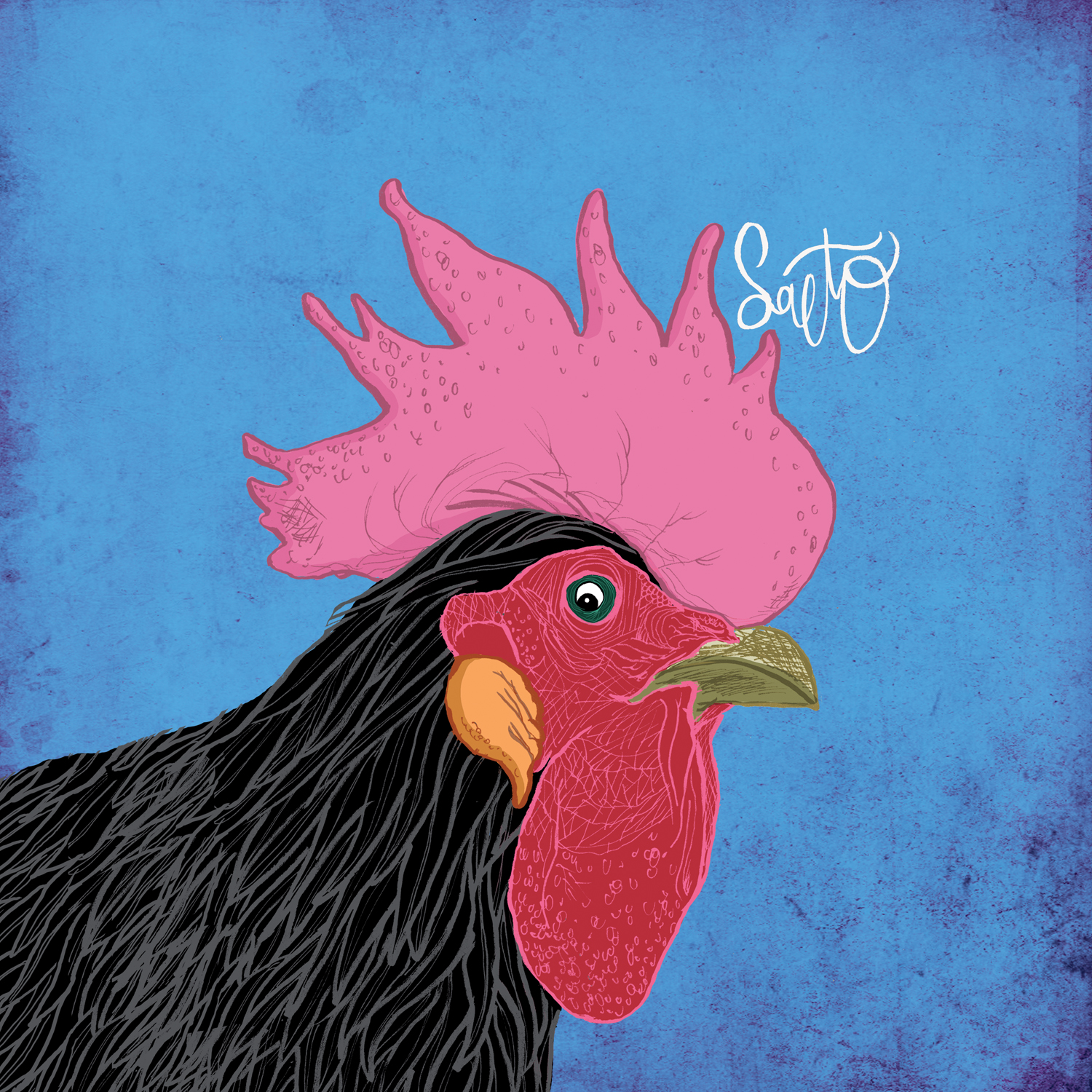
Esta es la portada que he creado para el primer disco de SALTO, el proyecto musical de Germán Salto. Después de seguir la carrera musical de Germán por varios grupos tenía muchas ganas de escuchar de lo que era capaz en solitario. Bien, esperaba mucho y no me ha decepcionado: este es el mejor disco que he escuchado en mucho tiempo.
Cuando Germán me contactó para hacer el artwork y me envió las maquetas ya me sonó muy sorprendente, muy claro, sin complejos. Este soy yo y esta es la música que hago. Suenan muchas y muy buenas influencias pero sobre todo suena a él y eso me encantó. Así que decidimos que teníamos que tener un artwork acorde, diferente a cualquier otro disco y lejos de una portada estándar y convencional. Una portada que llamase la atención, para bien o para mal.
Desde el principio manejamos la idea del gallo que para mí representa el despertar majestuoso de un artista hasta ahora agazapado como guitarrista de otras bandas. Además el gallo nos mira a la cara, fijamente, con su ojo en el centro de la portada. No se puede ser más directo en la idea que comunicamos al espectador: escucha este disco. Así de simple. Y el color, mucho color, que brille, que resalte sobre el resto.
Pero hubo otras ideas y probamos otros conceptos. Estas fueron las propuestas:
– Sketch 1:

Siguiendo la idea de “sorpresa” encontramos sobre el escenario un grupo de canciones representadas por seres monstruosos y simpáticos, con colores vivos. Es el Freak Show que ha manejado SALTO para convertirlo en un gran disco. Todas las ideas geniales de su cabeza ordenadas para crear una obra con sentido. Y el guiño del enchufe en las partes traseras no tiene ningún significado, no se lo busquéis!
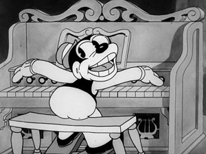
– Sketch 2:

SALTO toca para unos cocodrilos que han devorado a su montura y ahora le quieren devorar a él. Ellos bailan alegres y nuestro músico seguirá con vida mientras le duren las fuerzas. Es la imagen simbólica de un disco que no deja indiferente y que tiene potencial de llegar a cualquiera.
Manejábamos para esta opción la estética de los Merrie Melodies de los años 30 y 40. Fueron las primeras veces en que se mezclaba animación con sonido y música y el resultado es alucinante. La mezcla perfecta entre música, movimiento y dibujos: divertido y algo exagerado como los dibujos animados, incluso algo macabro. El asno devorado y ensangrentado da un toque inquietante aunque siempre con una estética de cartoon, no demasiado sanguinolento.
Algunas referencias que utilicé en el diseño:
El blanco y negro es muy característico de estos dibujos por lo que también manejamos esa versión, con toques rojos.

– Sketch 3:

Este es otra propuesta del uso del gallo. La idea para el disco-carpeta de cuatro caras era hacer en cada una de ellas a uno de los músicos de Bremen (gallo, gato, perro y burro) en el mismo estilo del gallo y que en lugar del burro apareciera Germán. Me parecía un guiño muy divertido y del que no todo el mundo se daría cuenta: creo que siempre es bueno quitar “ambición” y “grandilocuencia” al artwork de un disco, lo hace aún más grande. No tomarse muy en serio es bueno.
La idea nos encantó a los dos, pero decidimos que el gallo tenía mucha más fuerza por sí solo que como parte de un grupo. Y nos gustaba más la idea de crecimiento que la de los músicos.
Esta idea del “crecimiento artístico” es crucial, la base sobre la que se sostiene todo el diseño. Del huevo al pollito y de ahí al gallo. Por eso en el libreto interior aparece la huevera de gallina con el gallo listo para mostrarse, para salir al exterior. También utilizamos al pollito como portada del single para mantener la idea de que nuestro “animal” va creciendo hasta mostramos al gallo en todo su esplendor en el vinilo.

En cuanto a la contra del disco ahí no tuve dudas: tenía que aparecer Germán muy claramente, tal cual. Sin ninguna prenda que nos dé alguna idea preconcebida. Solamente Germán. La verdad es que esto es algo que él no tenía muy claro, pero yo sí. Queremos decir “Este es mi disco, mi creación y este soy yo”.
La fotógrafa Andrea Silván le hizo una sesión de fotos preciosas entre las que elegimos esta donde su ojo conecta con el ojo del gallo y nos mira directamente, al otro lado de las canciones:

Intenté que en la medida de lo posible todo el diseño estuviera hecho a mano. Hace que el conjunto sea más valioso y único y además en este caso me pareció que era lo que mejor funcionaba con la idea y la música del disco. Por eso tanto el gallo como todo el texto de los títulos y los créditos está hecho a mano:

Esta es la historia detrás de la creación del artwork para SALTO, un trabajo que he disfrutado especialmente y del que me ha encantado formar parte.
Una vez más el disco es fantástico, os lo recomiendo. Aquí podéis escucharlo.

House Of Clocks is the new book for young adults by British writer Amelia Thorne. This is the sinopsis:
“A summer holiday with an uncle in Amsterdam flings timid Alice into a world that she had never even dreamt of.
Lucas Van Duren is working on a secret project that if successful, will have massive global impact. A great many people would like to get their hands on the plans – people who would stop at nothing to get them.
But the project is not the only secret in Lucas’s mysterious ‘House of Clocks’. Lucas’s housekeeper Tineka, and his assistant Fred are not all they seem. Even the house itself seems to have a life of its own…”
It´s an awesome book, I couldn´t stop reading! And I love time travel stories, too!:)
When she contacted me for the assignment she sent me the book and told me it was meant to be the first one of a trilogy. That was important because we were going to need a common detail for the three covers, and that was going to be the way the title is written.
This is the story of Alice, so we wanted her on the cover. No more characters (at least in the first book): it´s her journey, she is the hero.
I also thought that the word “clocks” was very strong in the title and it means time, so it was a great symbol to talk about time travels and emphasize on the title of the trilogy.
These are the two sketches I sent to Amelia:
– Sketch 1:

It shows a typical Amsterdam house turned into a cuckoo clock. Alice is trapped inside of it, her scream for help comes out from when the little door opens to tell us what time it is. We also have a kind of “logo” in the title to connect the following books.


Yesterday was his birthday: best player ever!!
(original 9×12″ watercolor is on sale: email me if you are interested)

#jesuischarlie #charlieHebdo #fightignorance #freedomofpress #freedomofspeech

HAVE AN AWESOME 2015!!!!!!!

This is my little tribute to actor Ken Weatherwax, Pugsley in the original Addams Family TV series, who passed away yesterday. Chas Addams is one of my all time favorites illustrators and one of my biggest influences, I highly recommend you take a deep look at his work. He was a real master.
Thanks for reading!

This is the cover for PHLOWERS, the new album by the great Topher Mohr.
In the artwork for his first record Phlotilla, a flight attendant with tentacles invited us to take a long trip to her world. Now we are there, surrounded by shady characters and corrupted neo-noir dives.
Stay tuned!

